UI/UX Design


")

Reading time: 2 minutes.
Designed for Every Screen, Built for Every User
Over 60% of web traffic is on mobile. A website that breaks on a phone isn’t just a poor experience — it’s lost business. CimpleO designs and builds responsive interfaces that adapt cleanly across mobile, tablet, and desktop — without layout shifts, text that’s too small to read, or buttons too close to tap. Every pixel is intentional, every breakpoint is tested.
Mobile-First Design
We design for the smallest screen first, then scale up. Mobile-first isn’t just a buzzword — it forces prioritisation of what actually matters on a page and results in cleaner, faster experiences everywhere. Your content hierarchy, navigation, and calls-to-action are all considered for touch interfaces and small viewports before we think about desktop.
UI/UX Design
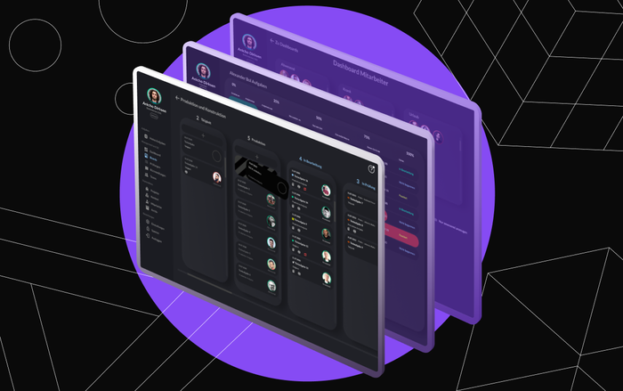
Interface design rooted in how people actually use products. We conduct user flow analysis, design interactive Figma prototypes, and iterate before writing code. Typography, spacing, colour, and interaction patterns chosen for legibility, accessibility, and clarity — not just visual appeal. Consistent design systems that scale as the product grows.
Frontend Development
The design, implemented precisely. We build with semantic HTML5, modern CSS (Grid, Flexbox, custom properties), and TypeScript. Bootstrap or Tailwind where it adds speed without adding bloat. Cross-browser testing on Chrome, Firefox, Safari, and Edge. Tested on real devices — not just browser DevTools resize mode.
Landing Page Design & Build
High-converting landing pages built for specific campaigns, products, or audience segments. Fast load times (sub-2s), above-the-fold clarity, and conversion-focused layouts. A/B test-friendly structure so you can optimise messaging and layout after launch based on real traffic data.
What Good Responsive Design Delivers
- Higher mobile conversion — users who can actually use your site on their phone actually convert
- Better SEO — Google’s mobile-first indexing means your mobile experience directly affects search rankings
- Reduced support burden — clear, functional interfaces generate fewer “how do I…” questions
- Faster development — a proper design system means consistent UI across the product without rework
Share your design challenge with us — we’ll show you how we’d approach it.
Frequently Asked Questions
How much does responsive web design cost?
A responsive marketing site (5–10 pages, custom design): $8,000–$20,000. A web application with complex UI and design system: $20,000–$60,000. Landing page campaigns: $3,000–$8,000 per page. Cost depends on design complexity, number of unique templates, and whether you have an existing brand system or need one built.
Do you design from scratch or work from our brand guidelines?
Both. If you have brand guidelines, we apply them consistently across the product. If you're starting from scratch, we develop the visual language — typography, colour system, spacing — as part of the project. Either way, you get Figma design files you own.
How do you test responsive designs across devices?
Browser DevTools simulation is the starting point, not the finish line. We test on real devices (iOS Safari, Android Chrome, tablet viewports) and use BrowserStack for broader coverage. We test at common breakpoints and at intermediate sizes that reveal layout bugs DevTools misses.
What's the difference between responsive design and adaptive design?
Responsive design uses fluid grids and CSS that reflows to any viewport size. Adaptive design serves fixed layouts at specific breakpoints. We build responsive by default — it handles the variety of real devices better and requires maintaining only one codebase.
Does good responsive design affect our search ranking?
Yes. Google's mobile-first indexing means your mobile experience is the primary signal for ranking. Core Web Vitals (LCP, CLS, INP) are measured on mobile. A slow, layout-shift-heavy mobile experience directly harms your ranking. We target strong Core Web Vitals as part of every responsive build.