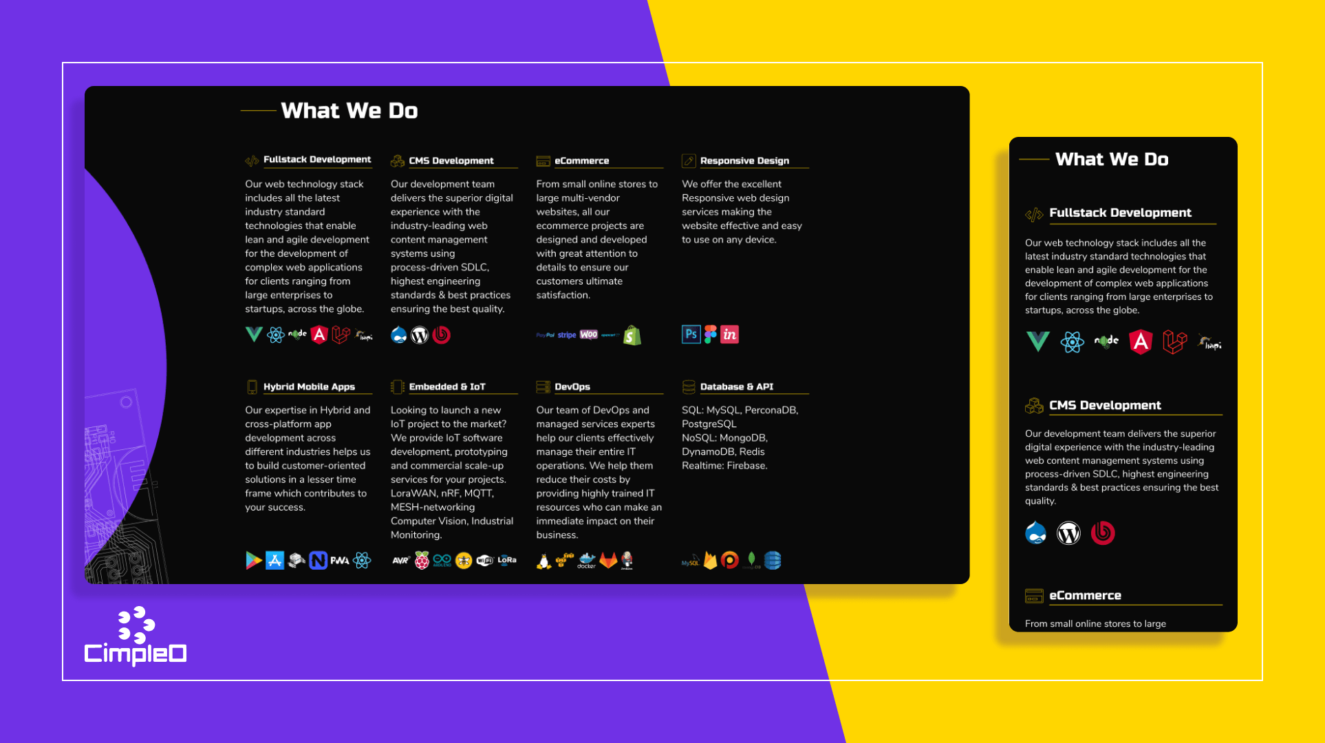
For a long time, we were confused by the lack of a complete description of our services on the site. We are more than just a web studio, we also developers of integrated IoT solutions, full-fledged web services, and mobile applications.
Objectives
Add comfort. The site did not have a normal grid, so the site looked unbalanced and, as a result, difficult to read and comfortable for perception.
Add style. The site did not match our visual style. There were different color palettes on social media and the website. It was decided to develop a new website design from scratch.
UX design
There are three major changes to note here:
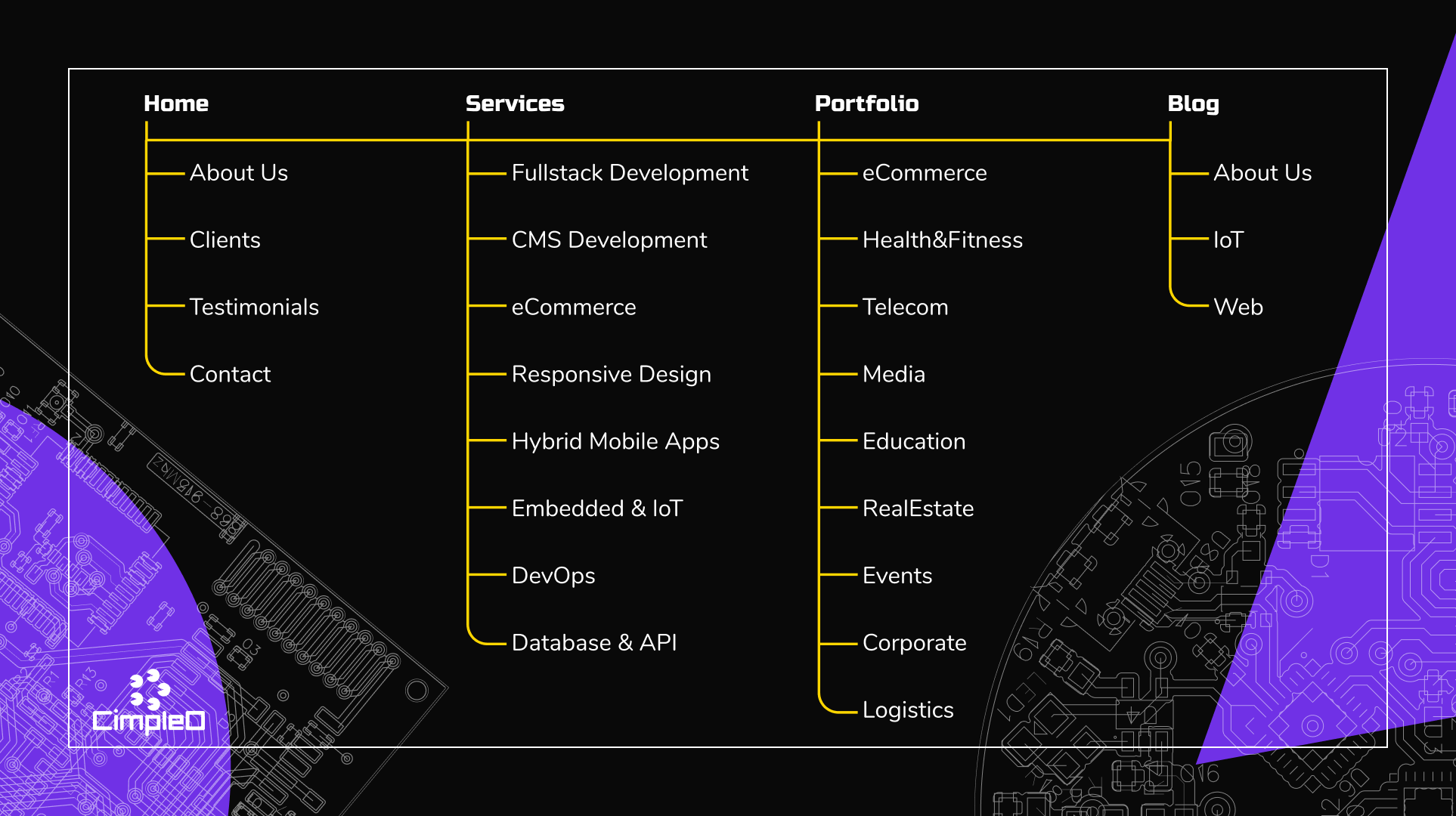
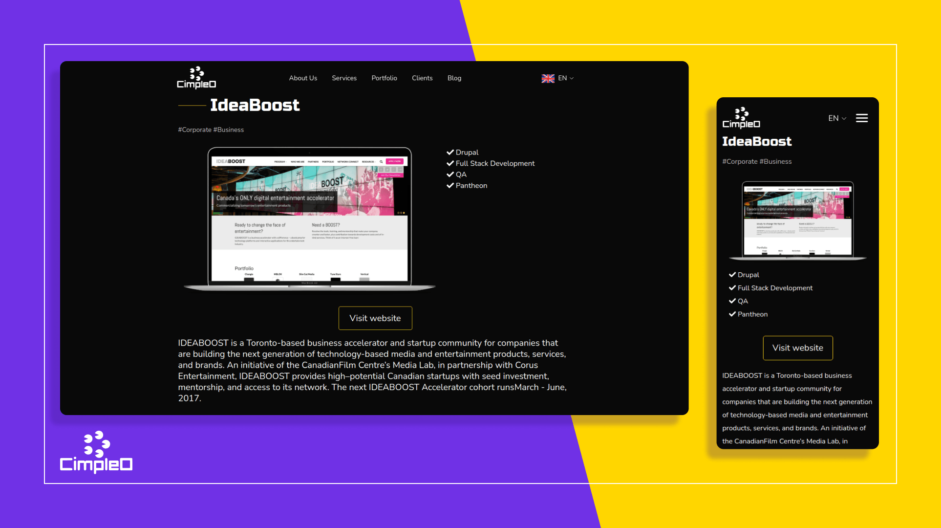
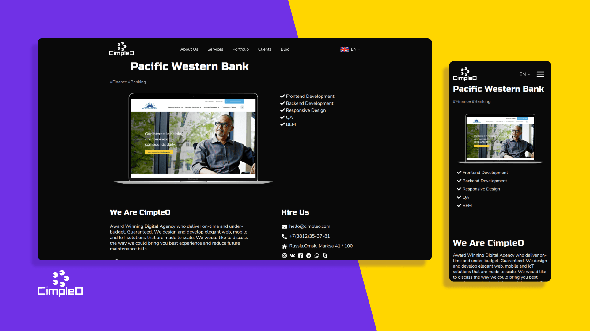
- We have improved the navigation. Now, when clicking on each of the blocks of services, the user is redirected to a section with detailed information about it.
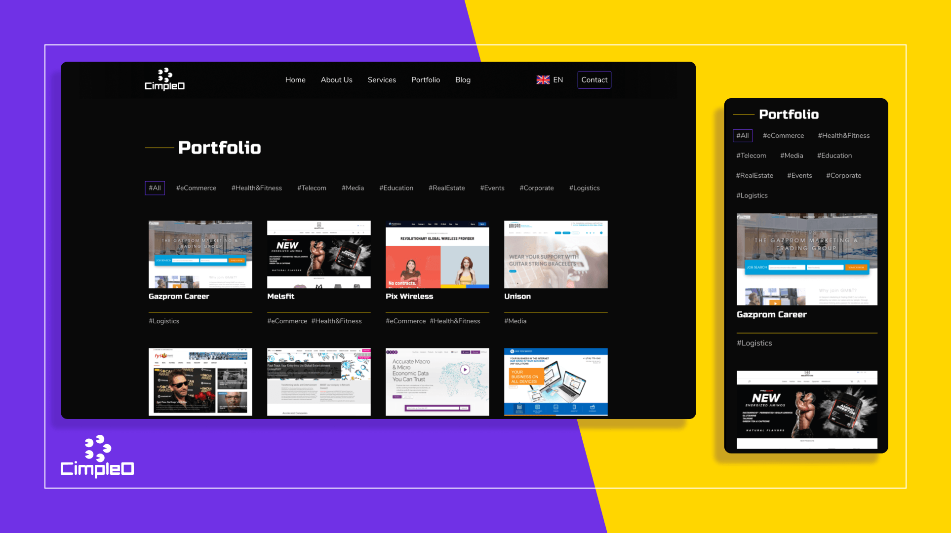
- We worked out the structures of the blocks on the page. We’ve improved their compatibility by using a common grid for the entire site.
- We told more about the company. In particular, we added more information about what we do, what services we provide, and what tools we work with.
UI design
Because the color palette was different for each social network and site, it was decided to completely revise the fonts and colors. Among other things, it helped make the new design more consistent. Let’s talk about everything in more detail.
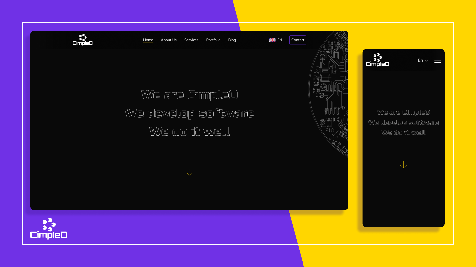
Colors
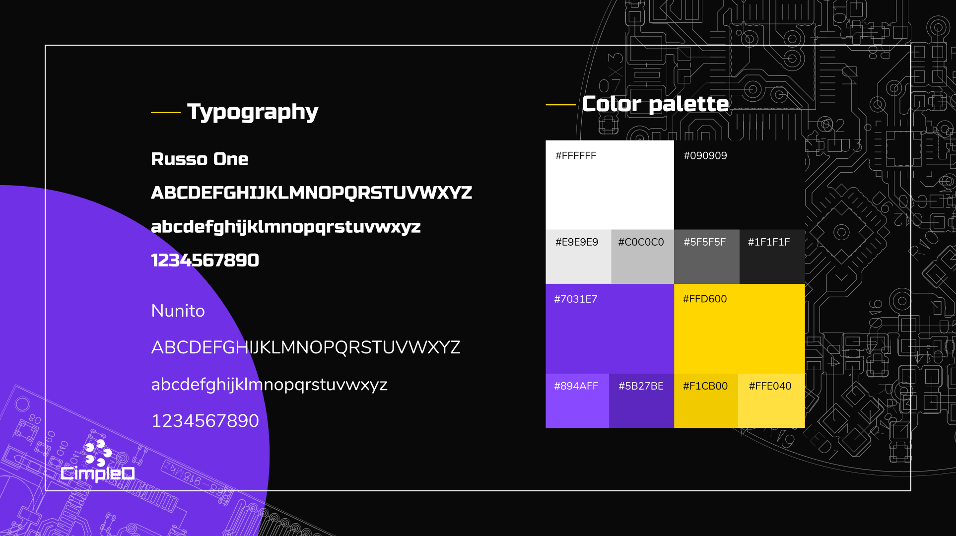
The color palette has become simpler and more contrasting. Black contrasts with white, just like yellow and purple.
This color scheme was caused by the desire to convey our professional attitude and serious approach to work. But it was also important to convey the absence of excessive severity and stiffness. As a result, the design is intended to reflect reliability and flexibility in work, intelligence and a friendly attitude, both to clients and partners and to the company’s employees.
Fonts
For the headings, bold chopped “Russo One” was chosen. The light and readable “Nunito” is matched to it. The fonts fit together and emphasize each other, making the text easier to read.
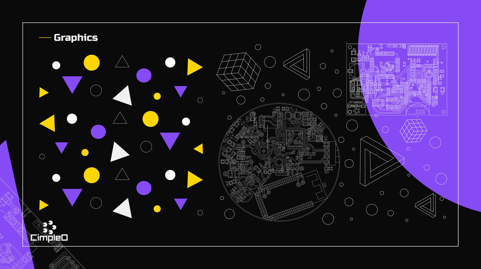
Graphic arts
For the graphics of the site, unique illustrations have been added, including both simple shapes and complex geometric shapes, such as the Penrose triangle and even the Rubik’s cube.
To emphasize the company’s technological focus, the graphics were added to the circuit boards developed by our engineers, and they were reproduced as close to the original as possible.
Front-end development
We decided to use a Glide carousel for our sliders. It was also decided to completely abandon the jQuery library, which allowed us to optimize the site.
The site is written in native JavaScript and augmented with TypeScript. All statistics and HTML are generated using Hugo + Webpack. The site is assembled using GitlabCI and fully cached in the CDN. All this provided excellent optimization and site performance.
Conclusion
The site is already ready and has passed all the necessary tests. Now it has become even more beautiful, faster and more convenient. We fixed the shortcomings of the previous version, having completed all the tasks assigned to us.
From now on, our site corresponds to the visual style of the company, it is much easier to read and fully reflects the entire range of our services. Come visit us!